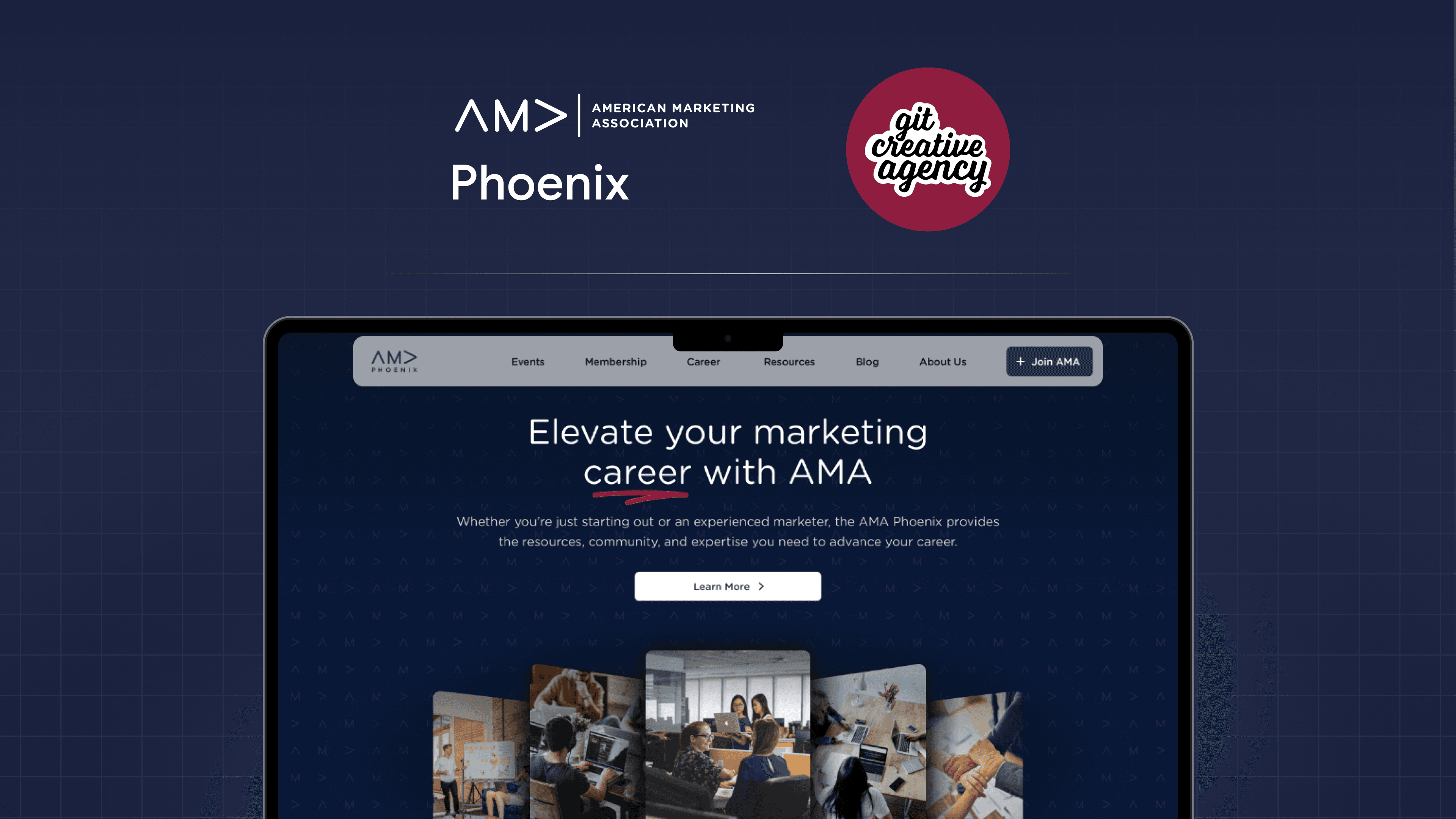
Revamping web design for American Marketing Association

AMA Phoenix Website Redesign

The AMA Phoenix website is a key hub for marketing professionals and students. This redesign focused on streamlining navigation, boosting accessibility, and creating a seamless digital experience, all with the goal of turning visitors into active AMA Phoenix members.

Yellow Flower

My Role

UX Designer

Duration

3 Months

Tools

Figma, Figjam, Slack, Wix

Revamping web design for American Marketing Association

AMA Phoenix Website Redesign

The AMA Phoenix website is a key hub for marketing professionals and students. This redesign focused on streamlining navigation, boosting accessibility, and creating a seamless digital experience, all with the goal of turning visitors into active AMA Phoenix members.

Yellow Flower

My Role

UX Designer

Duration

3 Months

Tools

Figma, Figjam, Slack, Wix

Revamping web design for American Marketing Association

AMA Phoenix Website Redesign

The AMA Phoenix website is a key hub for marketing professionals and students. This redesign focused on streamlining navigation, boosting accessibility, and creating a seamless digital experience, all with the goal of turning visitors into active AMA Phoenix members.

Yellow Flower

My Role

UX Designer

Duration

3 Months

Tools

Figma, Figjam, Slack, Wix

Overview

/Challenge

/Challenge

/Challenge

Users struggled with confusing navigation, disorganized pages, and hard-to-find resources, resulted in a fragmented experience. The site’s text-heavy design made it difficult to quickly scan information, while outdated visuals and limited functionality hindered engagement and content management.

/Solution

/Solution

/Solution

Redesigning the website with a sleeker, more intuitive interface that enhances usability, boosts user engagement, drives event participation, increases membership sign-ups, and improves overall satisfaction, all while aligning with AMA Phoenix’s brand identity.
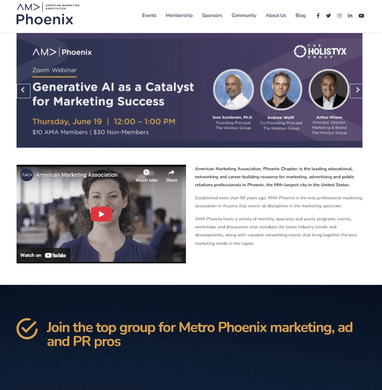
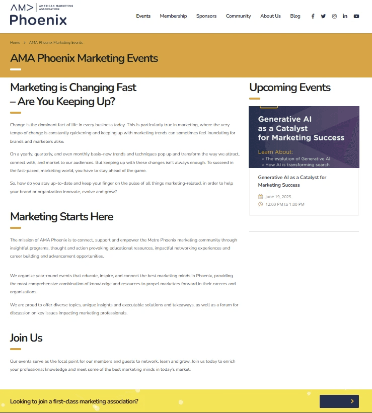
Initial Website Layout

Initial Website Layout

Initial Website Layout

Research

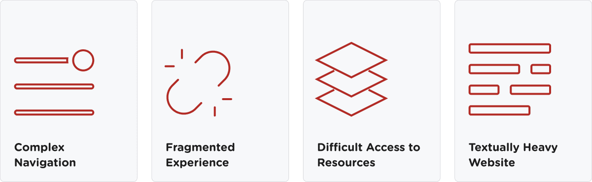
Our research indicated that users faced several challenges while navigating the current platform, impacting their experience and efficiency. We identified the key user pain points which include:
User Personas
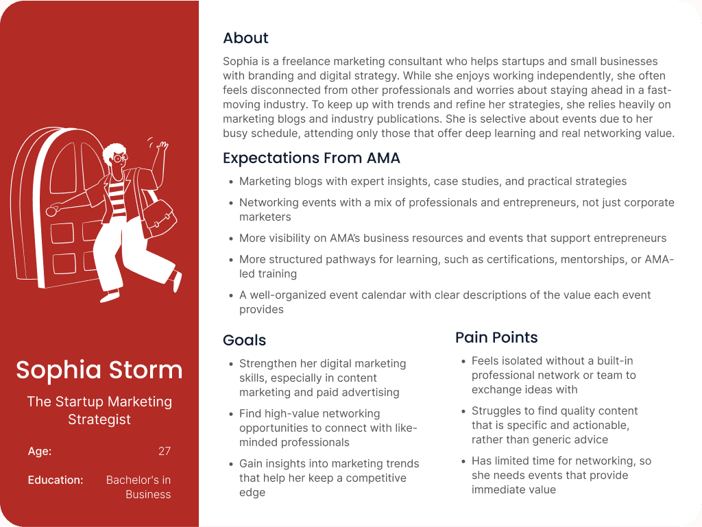
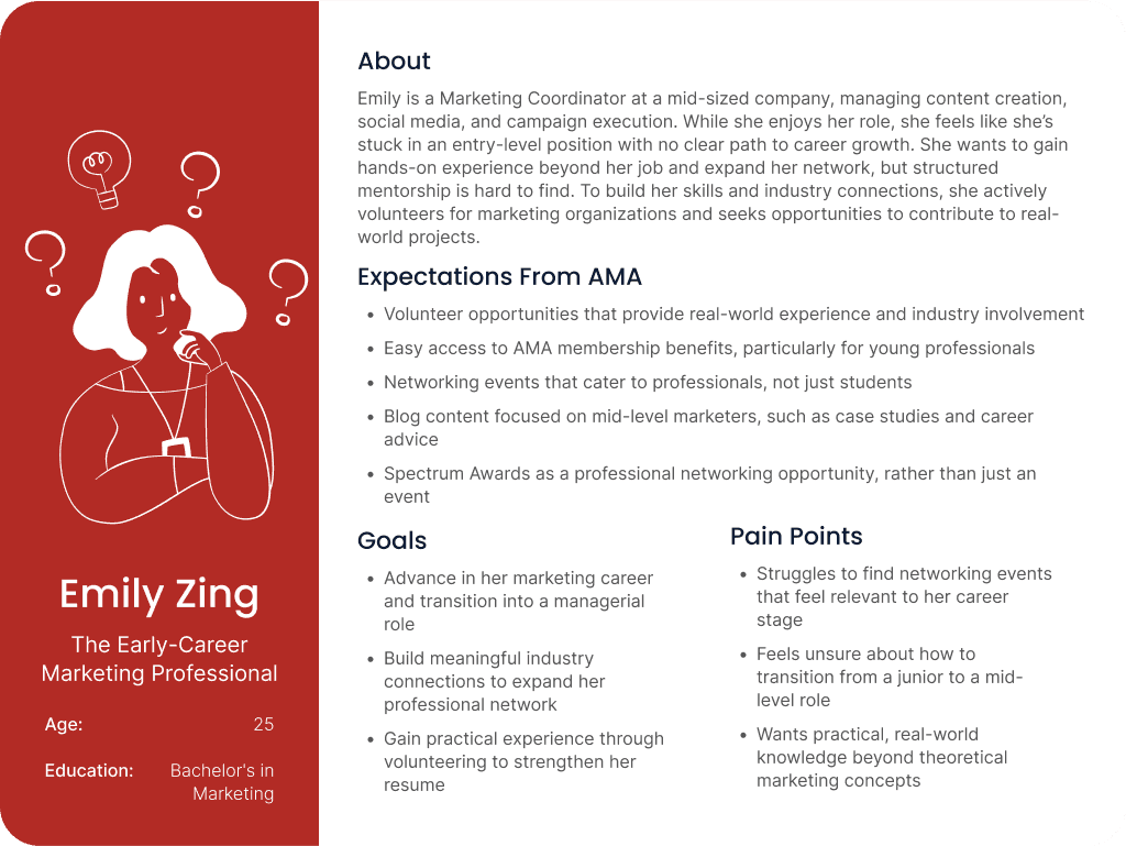
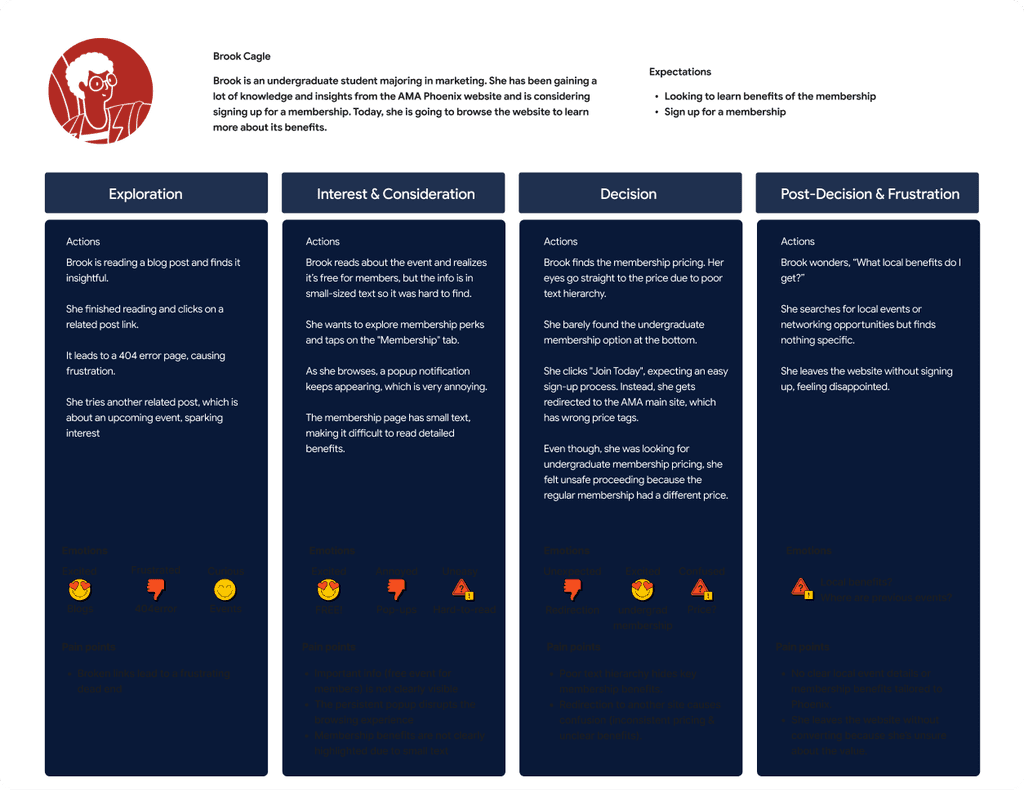
These insights helped us focus on real user needs and expectations, guiding decisions around content structure, features, and overall usability.

User Personas

These insights helped us focus on real user needs and expectations, guiding decisions around content structure, features, and overall usability.

User Personas

These insights helped us focus on real user needs and expectations, guiding decisions around content structure, features, and overall usability.

User Journey Map

User Journey Map

User Journey Map

User Personas

Journey Map

Site Map

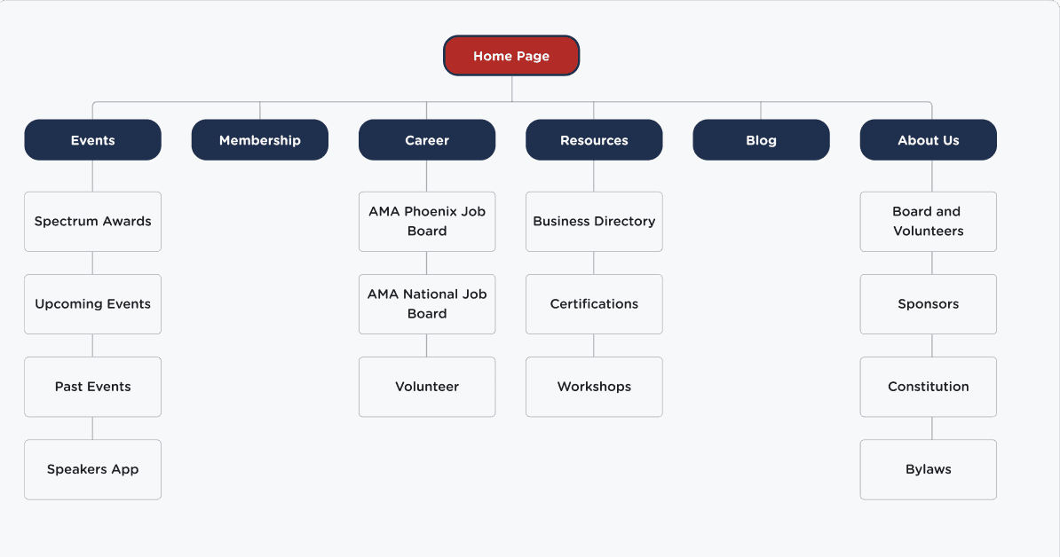
One of the early priorities was reorganizing the site’s information architecture to make it more intuitive for users. We mapped out a new site structure that grouped content more logically, reducing clutter and improving overall flow. This helped us create a seamless navigation experience, ensuring users could find what they needed quickly, whether they were members, volunteers, or first-time visitors.

Site Map

One of the early priorities was reorganizing the site’s information architecture to make it more intuitive for users. We mapped out a new site structure that grouped content more logically, reducing clutter and improving overall flow. This helped us create a seamless navigation experience, ensuring users could find what they needed quickly, whether they were members, volunteers, or first-time visitors.

Site Map

One of the early priorities was reorganizing the site’s information architecture to make it more intuitive for users. We mapped out a new site structure that grouped content more logically, reducing clutter and improving overall flow. This helped us create a seamless navigation experience, ensuring users could find what they needed quickly, whether they were members, volunteers, or first-time visitors.

Let's Talk Visuals

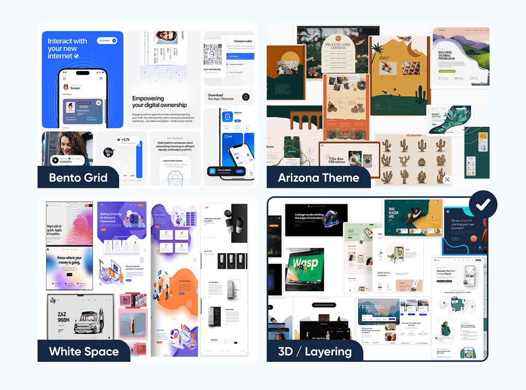
We drafted 4 options on visual design direction for the web presence of AMA Phoenix. After pitching the themes, the client decided to move forward with theme 3D/ Layering.

Let's Talk Visuals

We drafted 4 options on visual design direction for the web presence of AMA Phoenix. After pitching the themes, the client decided to move forward with theme 3D/ Layering.

Let's Talk Visuals

We drafted 4 options on visual design direction for the web presence of AMA Phoenix. After pitching the themes, the client decided to move forward with theme 3D/ Layering.

Redesign Sketches

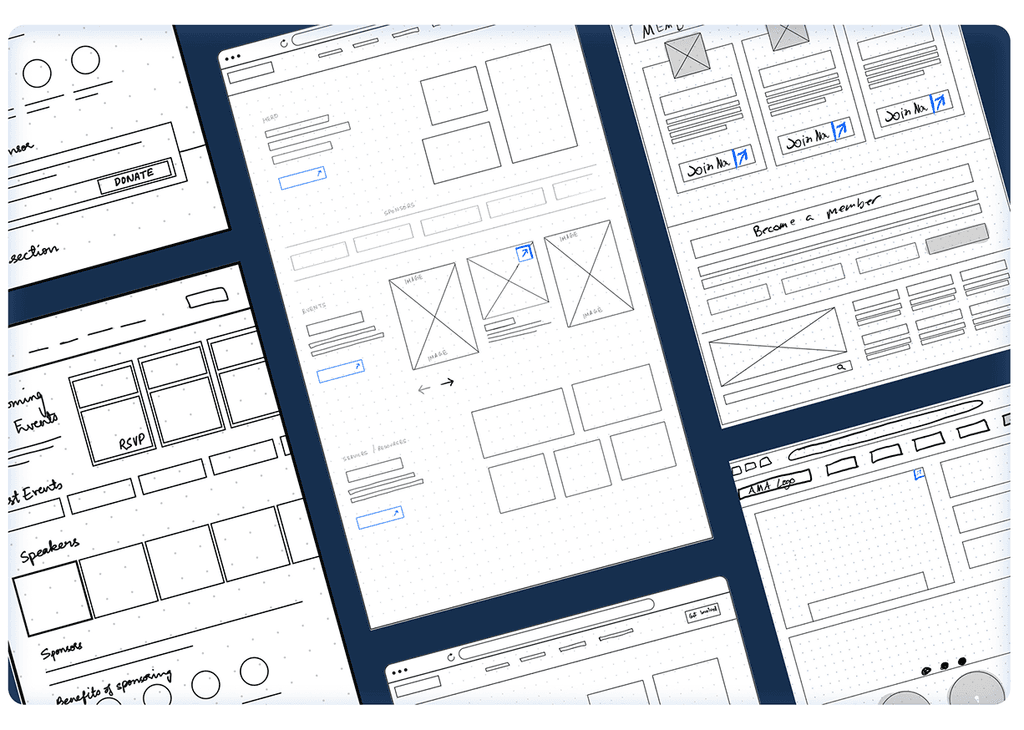
We began this adventure with some low-fidelity wireframes, experimenting layouts and the theme chosen by the client.

Redesign Sketches

We began this adventure with some low-fidelity wireframes, experimenting layouts and the theme chosen by the client.

Redesign Sketches

We began this adventure with some low-fidelity wireframes, experimenting layouts and the theme chosen by the client.

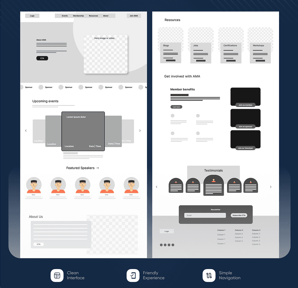
Building Wireframes

Now that the client approved the design idea, we then started designing wireframes that would be essential as a foundation to the final mockups.
Design System

A custom design system rooted in AMA Phoenix’s brand guidelines ensured visual consistency and scalability. It unified typography, color, components, and spacing, streamlining collaboration and supporting long-term growth. It wasn’t just about visuals, it was about creating a structure that could grow with AMA.

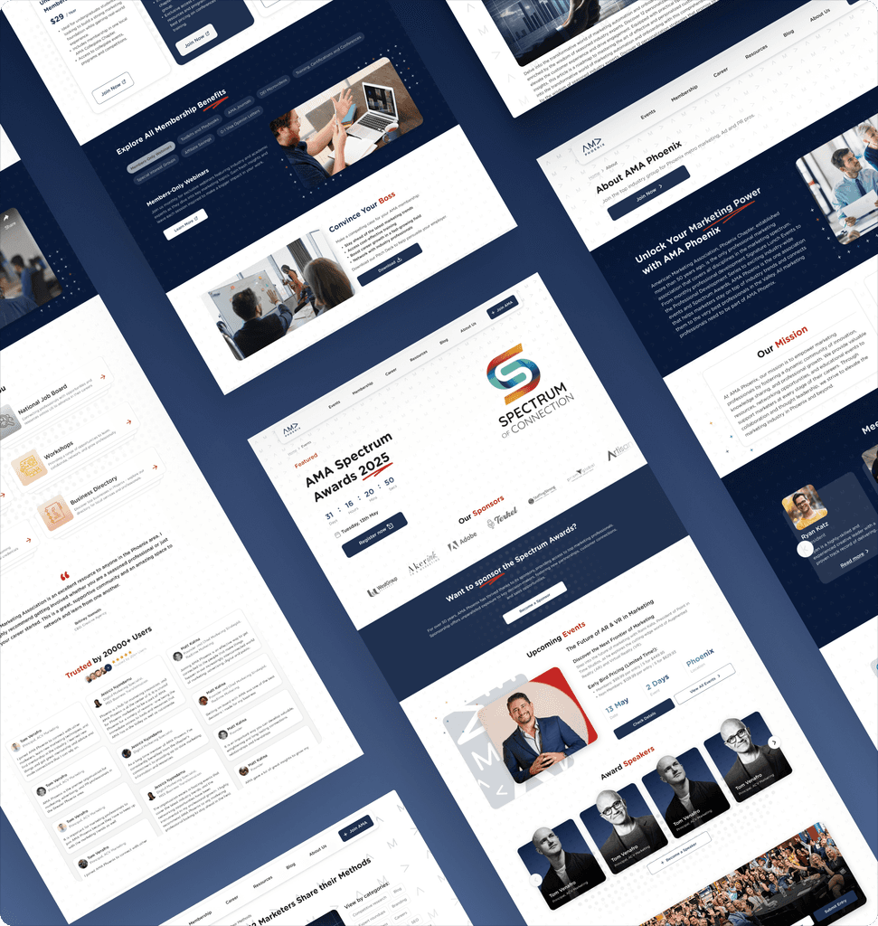
Final Mockups

Final Mockups

Final Mockups

Potential Impact

  • User- Centered Design: Applied accessibility principles and clear content hierarchy to design responsive layouts within real-world constraints.

  • Active Iterations: Translated client feedback into practical, scalable design decisions through continuous iteration.

  • Brand Identity: Built a cohesive design system that ensured consistent UI and aligned with brand and business goals.

  • Team Player: Strengthened collaboration through rapid feedback loops, clear communication, and lots of caffeine.
Learning & Growth

  • User- Centered Design: Applied accessibility principles and clear content hierarchy to design responsive layouts within real-world constraints.

  • Active Iterations: Translated client feedback into practical, scalable design decisions through continuous iteration.

  • Brand Identity: Built a cohesive design system that ensured consistent UI and aligned with brand and business goals.

  • Team Player: Strengthened collaboration through rapid feedback loops, clear communication, and lots of caffeine.