How and why I redesigned ASU Shuttle Rider Portal

ASU Shuttle Rider Portal

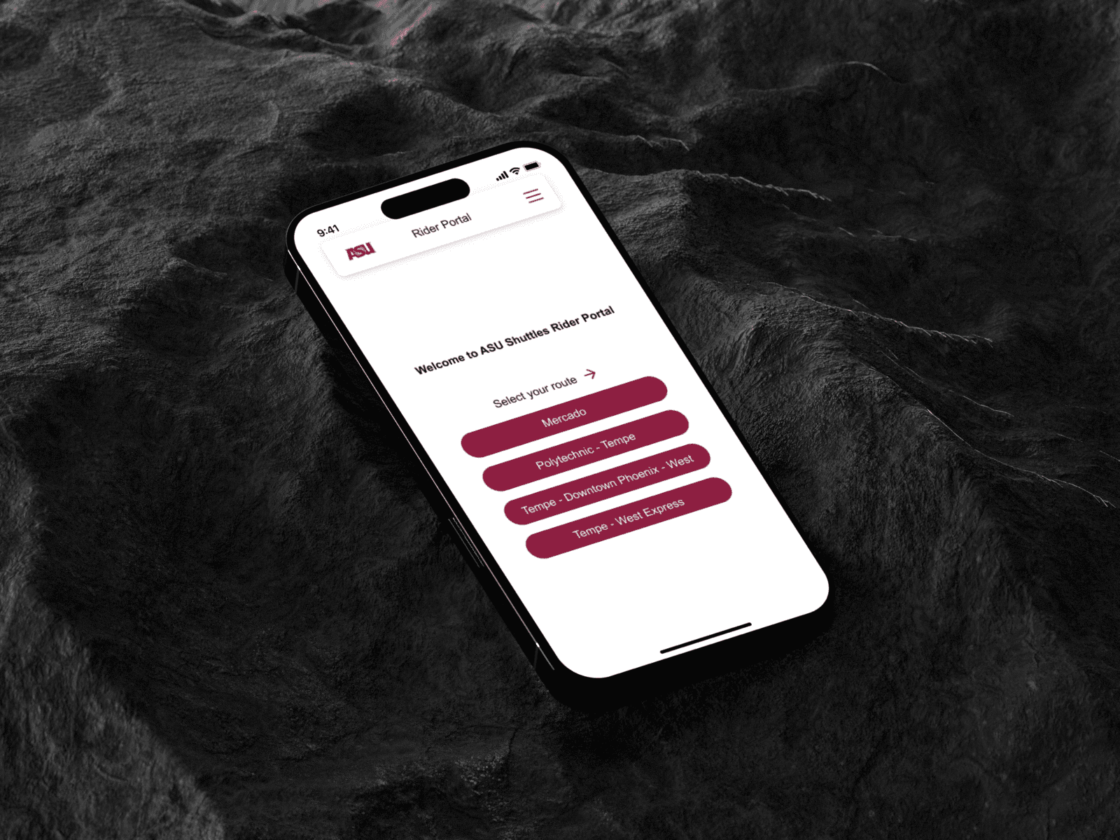
ASU’s intercampus shuttles are essential for student commuters, especially international students. However, the current tracking site is difficult to use on mobile, with unclear navigation and limited accessibility. This redesign simplifies the experience with a more intuitive interface, reducing ambiguity and providing clear, real-time feedback.

My Role

UX Designer and Researcher

Duration

2 weeks

Tools

Figma, Balsamiq, Canva

How and why I redesigned ASU Shuttle Rider Portal

ASU Shuttle Rider Portal

ASU’s intercampus shuttles are essential for student commuters, especially international students. However, the current tracking site is difficult to use on mobile, with unclear navigation and limited accessibility. This redesign simplifies the experience with a more intuitive interface, reducing ambiguity and providing clear, real-time feedback.

My Role

UX Designer and Researcher

Duration

2 weeks

Tools

Figma, Balsamiq, Canva

Overview

/Challenge

/Challenge

ASU’s shuttle tracking website, while essential for student commuters, is difficult to use on mobile devices. Users struggle with unclear navigation, unresponsive gestures, limited accessibility, and a lack of real-time feedback, leading to confusion, delays, and a frustrating experience when trying to track shuttles.

/Solution

/Solution

Redesigned the ASU shuttle tracking experience with a mobile-first, user-centered approach. The new design simplifies navigation, enhances accessibility, and provides clear, real-time feedback. Grounded in user research and validated through usability testing, the solution offers a cleaner, more intuitive interface aligned with ASU’s brand.

Design Process

From stepping into users’ shoes to crafting the perfect sole, this dynamic, non-linear design thinking process transforms exploration into user-centered, deliverable solutions.

  • Empathize

    This project was personal, I’ve experienced the frustration of using the current shuttle tracking site. But as the saying goes, you are not your user. To truly understand the problem, I conducted user interviews and gathered real-world stories from fellow ASU students to uncover their experiences, pain points, and expectations.

  • Define

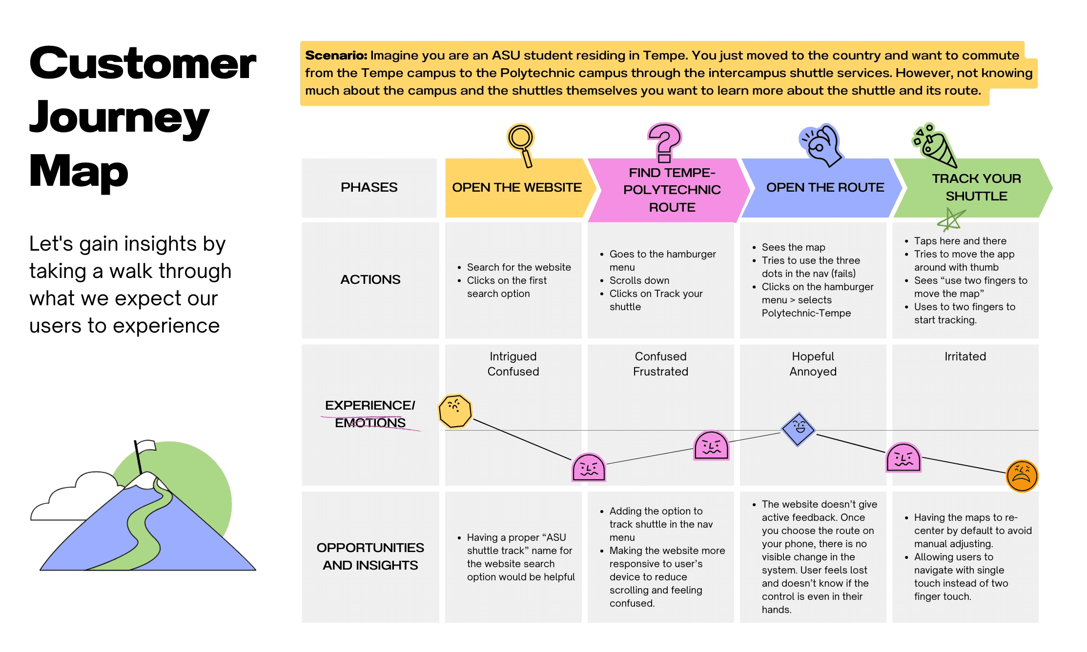
    Synthesized insights from interviews into a user persona representing the average ASU shuttle commuter, their goals, needs, and frustrations. Additionally, created a user journey map to define a typical interaction, highlighting key touchpoints and friction areas to clarify the core problems addressed in the redesign.

  • Ideate and Prototype

    Explored solutions grounded in user needs, focusing on simplifying navigation, improving mobile usability, and aligning with ASU’s brand identity. Developed low- and mid-fidelity prototypes to bring ideas to life and prepare the design for testing and feedback.

  • Test

    Conducted moderated usability testing with ASU students to evaluate the prototype’s effectiveness. Observations and insights revealed areas of improvement- informing the next iteration of the high-fidelity prototype.

Design Process

From stepping into users’ shoes to crafting the perfect sole, this dynamic, non-linear design thinking process transforms exploration into user-centered, deliverable solutions.

Empathize

This project was personal, I’ve experienced the frustration of using the current shuttle tracking site. But as the saying goes, you are not your user. To truly understand the problem, I conducted user interviews and gathered real-world stories from fellow ASU students to uncover their experiences, pain points, and expectations.

Define

Synthesized insights from interviews into a user persona representing the average ASU shuttle commuter, their goals, needs, and frustrations. Additionally, created a user journey map to define a typical interaction, highlighting key touchpoints and friction areas to clarify the core problems addressed in the redesign.

Ideate and Prototype

Explored solutions grounded in user needs, focusing on simplifying navigation, improving mobile usability, and aligning with ASU’s brand identity. Developed low- and mid-fidelity prototypes to bring ideas to life and prepare the design for testing and feedback.

Test

Conducted moderated usability testing with ASU students to evaluate the prototype’s effectiveness. Observations and insights revealed areas of improvement- informing the next iteration of the high-fidelity prototype.

User Stories

Collected user stories from ASU students to understand their daily commuting challenges, expectations, and behaviors. These insights helped uncover specific pain points in the current shuttle tracking experience and ensured the redesign was rooted in real, relatable user needs.

User 1

“I need to know when the shuttle is arriving so I don’t miss my weekend shifts.”

User 1

“I need to know when the shuttle is arriving so I don’t miss my weekend shifts.”

User 2

User 2

User 3

User 3

User 4

User 4

User Persona

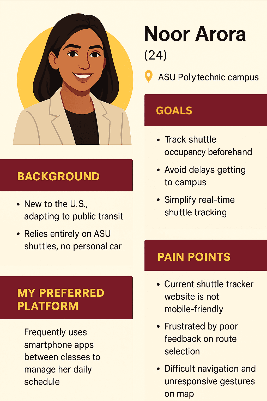
Based on user stories, I developed a persona representing a typical ASU student commuter, highlighting their goals, behaviors, and frustrations with the current shuttle tracking experience.
Journey Map

This map visualizes the user’s step-by-step journey, from landing on the site to tracking a shuttle, capturing key emotions, friction points, and improvement opportunities. It revealed critical mobile usability issues such as unresponsive gestures and the lack of intuitive one-touch map interaction.

Journey Map

This map visualizes the user’s step-by-step journey, from landing on the site to tracking a shuttle, capturing key emotions, friction points, and improvement opportunities. It revealed critical mobile usability issues such as unresponsive gestures and the lack of intuitive one-touch map interaction.

User Flow

This streamlined user flow maps how a student navigates the site to track a shuttle, starting from the homepage to selecting a route and beginning live tracking. It shaped the prototype’s structure by reducing steps, simplifying decisions, and supporting a seamless mobile experience.

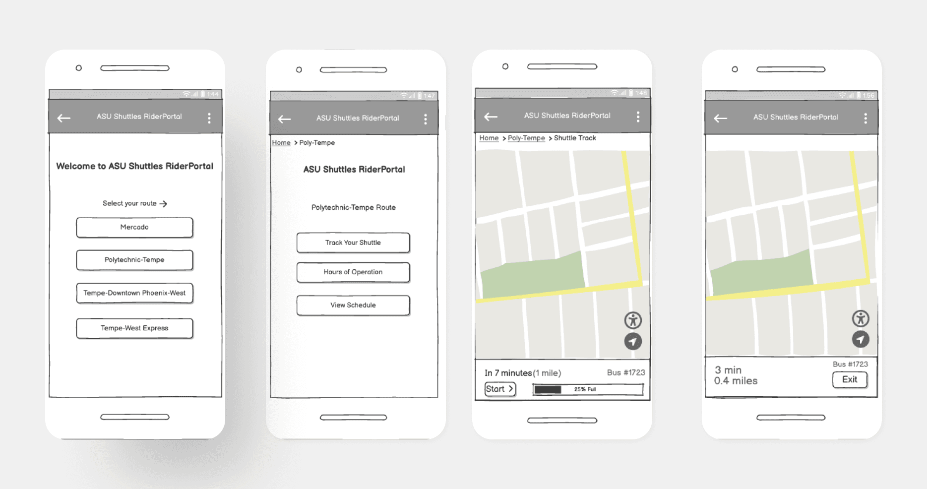
Low Fidelity Wireframes

Early low-fidelity wireframes helped translate user needs into structure, focusing on layout, flow, and key interactions before refining the visuals.

Low Fidelity Wireframes

Early low-fidelity wireframes helped translate user needs into structure, focusing on layout, flow, and key interactions before refining the visuals.

Usability Testing

Usability testing on the low-fidelity prototype surfaced early friction points, guided design improvements, and validated the core structure ahead of high-fidelity development. Below are the key findings that shaped the next iteration:

  • 01

    Positive first impressions

    Initial screens were described as intuitive and easy to follow.

  • Navigation clarity

    Breadcrumb navigation was helpful, but users suggested improving font size and visibility.

    02

  • Redundant steps

    Users found the extra “Start” button unnecessary after selecting a route.

    03

  • Feedback expectations

    Users expected immediate visual or tactile feedback when starting or exiting tracking.

    04

01

Positive first impressions

Initial screens were described as intuitive and easy to follow.

Navigation clarity

Breadcrumb navigation was helpful, but users suggested improving font size and visibility.

02

Redundant steps

Users found the extra “Start” button unnecessary after selecting a route.

03

Feedback expectations

Users expected immediate visual or tactile feedback when starting or exiting tracking.

04

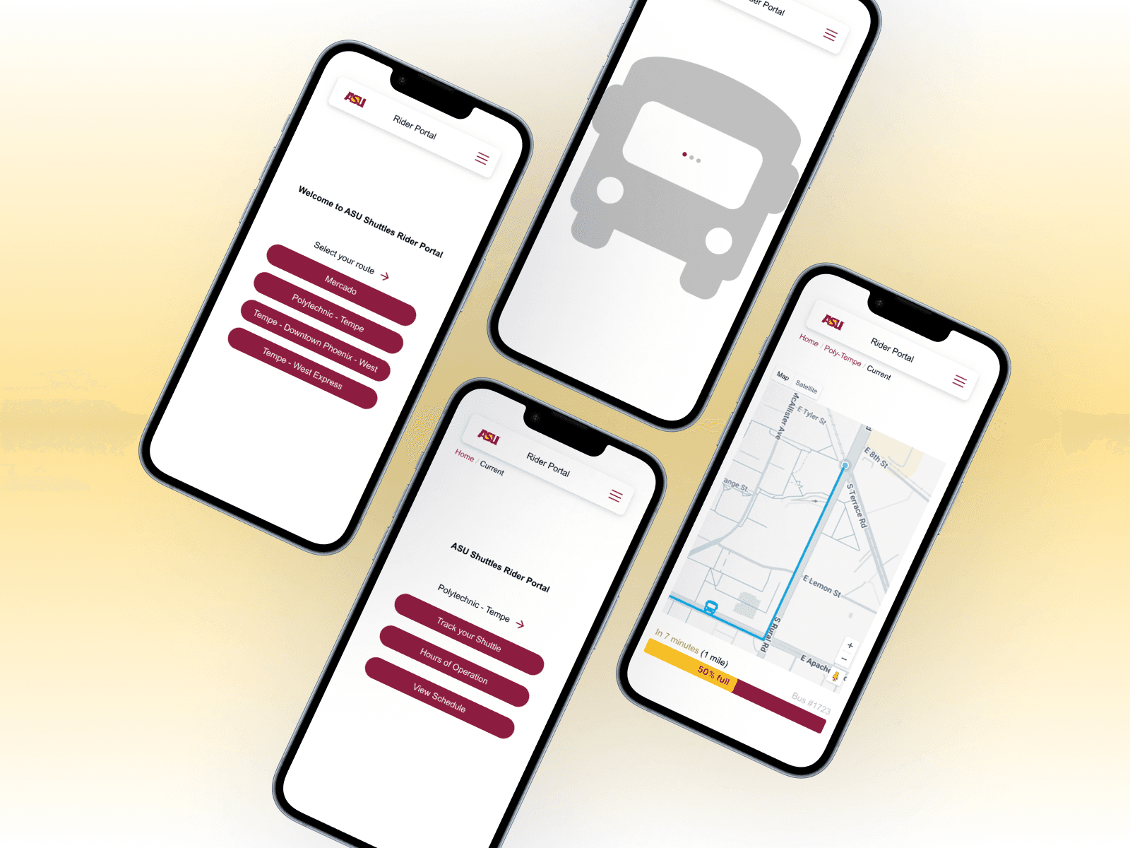
High Fidelity Mockups

Bringing the final designs to life with visual clarity, brand alignment, and an intuitive, mobile-first experience.
Before Vs After

Old

New

Next Steps

Implement high-fidelity prototype into an interactive, testable format.

Conduct broader usability testing with a more diverse group of ASU students.

Collaborate with ASU stakeholders for potential real-world adoption or pilot testing.

Explore feature expansion, including shuttle capacity tracking and GPS-based auto-centering.

Code real-time tactile feedback to alert users via phone vibration as a shuttle approaches.

Learning and Growth

Learned how to translate user pain points into actionable design solutions.

Grew as a collaborator and facilitator through interviews and usability testing.

Gained experience in designing for accessibility, responsiveness, and system clarity.

Strengthened my ability to create scalable, brand-aligned UI systems